Catfish Alley cover design brief
As a starting point, there is a sub-genre of crime novels by British writers in European settings. Some of these seem to be quite successful commercially, so we may want to aim for that space. The ones which seem to me have the best covers are the ones below:

This one is set in Italy, but I think it captures the European flavour well. There are several others in the same series.

This series has a Spanish setting and a similar aesthetic to the previous one.

This is another Spanish-set series, and while the image is not quite as specific, it does capture the noir feel well.
I had mocked up something similar using a Barcelona setting:

This isn't very professional but captures the idea of people in a grungy Barcelona street scene.
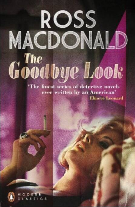
If we wanted a different approach altogether, the book also has its roots in 1950s/60 pulp crime fiction. There's a great series of Penguin reissues of Ross MacDonald's Lew Archer novels from this period which have a really striking aesthetic - here are a couple:

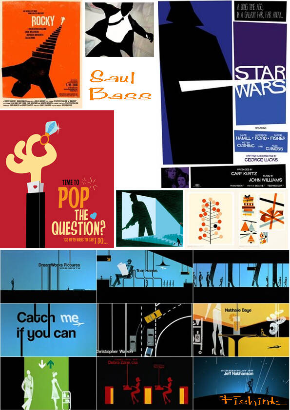
In a similar vein, the book (and particularly its sequel) owe a strong debt to 1950s Hitchcock movies. The iconic designer associated with these films is Saul Bass. I've show below (left) some of his classic movie posters and (right) posters inspired by his work.


I'd also done some concept art for the potential series myself - this mood board on the left is the what one of the AI generators came up with when I fed it with some Saul Bass/femme fatale/Barcelona prompts.
When I was expecting to self-publish, I'd had a go at trying to capture as many of these aspects as possible. I don't think it's completely successful but it gives a sense of one way we might go. I'm sure there are others!
